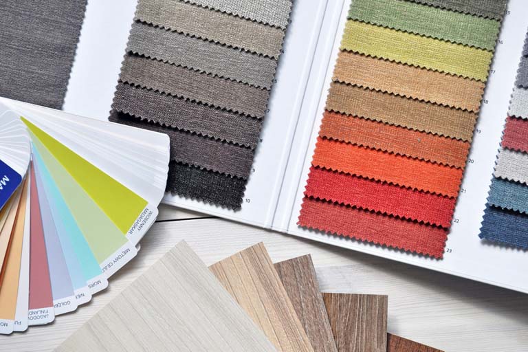
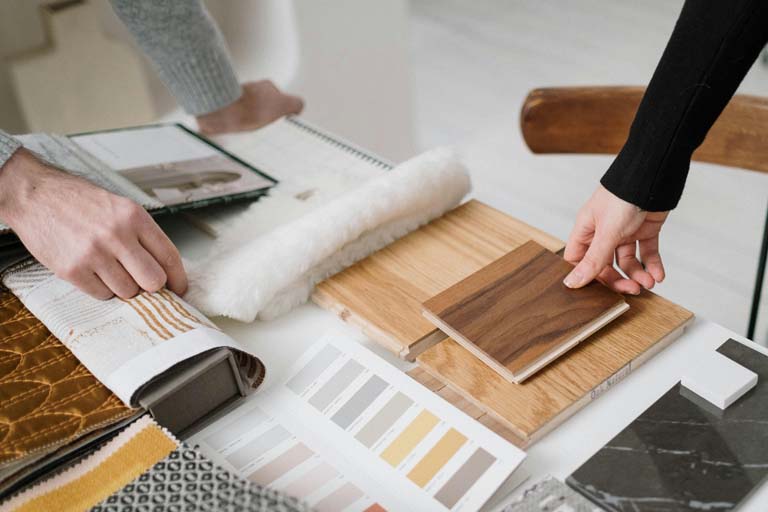
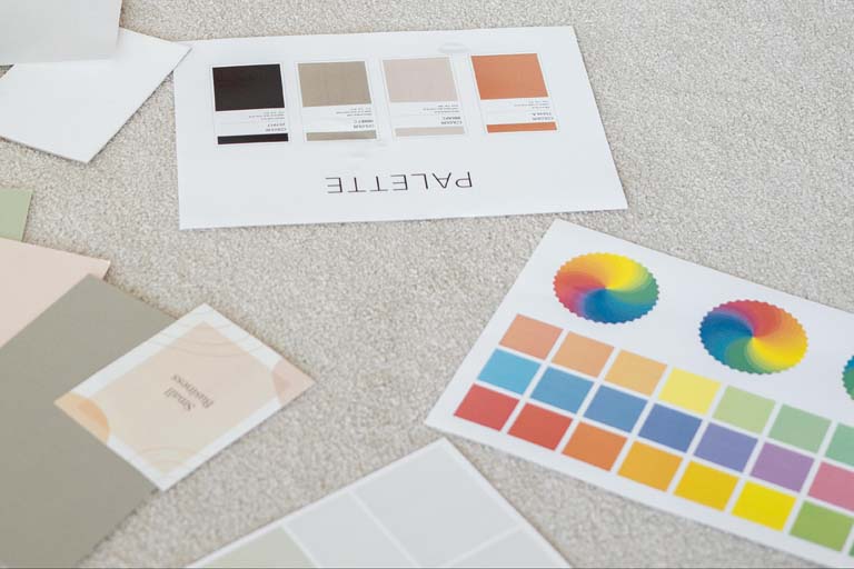
Flooring colors are so crucial to our homes. Color also affects our lives in such a profound way that an entire field of science is dedicated to color, called colorimetry. Colorimetry is the scientific method employed to measure colors in a numerical way. This establishes an objective and more reliable way to pick a color palette vs. the subjective way different people will interpret the same color differently.
We're pretty sure you've encountered the way two people perceive the same color differently. "That's blue!" someone will declare. "Are you kidding? It's purple." will swear someone else. Or, maybe you've had trouble trying to agree with someone else about whether a certain color is beige or tan, or taupe.
Chances are, when it comes to picking out the color scheme in your living space, how you interpret color may be quite different from the way someone at a big box store would. Deciding on a flooring option is important enough to see the actual flooring colors for yourself in your home before you make any important decisions.

Installing oak flooring that isn't really the color you wanted because of a misunderstanding can be costly and disappointing. Being thorough is worth it. Along with being difficult to calibrate the way color is perceived, how different colors make us feel is a personal thing.
There is an entire field of psychology that examines the effect of different colors on our senses, our emotions, and our behaviors. Picking a color isn't easy, and that's why most people limit themselves to only the safest shades.
Color Sets the Mood Whether or Not You're Aware of It
The way color affects our lives has been hard-wired into our biology for thousands and thousands of years. Without even being consciously aware of it, "cooler" tones of green, gray, and blue can calm us, while vibrant colors like vermilion and bright yellow can stimulate us.
The colors we choose can either contribute to a heightened sense of excitement or, conversely, a heightened feeling of caution. It all depends on the actual color. Typically, the absence of color doesn't create much of a reaction at all, either positively or negatively. Yes, it's easier to be bland but sometimes it might be a missed interior design opportunity.
The Safe Way to Get "Un-stuck" with Your Flooring Colors Choices
Setting the mood with color can be a little intimidating at first. That's why many of us get stuck with the same old, same old. That's too bad. Here are a few tips you can use to build your confidence to create the room feel you want.
- How wide-ranging will your changes be? Is it just a bathroom floor or the floor in a small room? If so, live a little. Experiment with some samples of the floor and the walls.
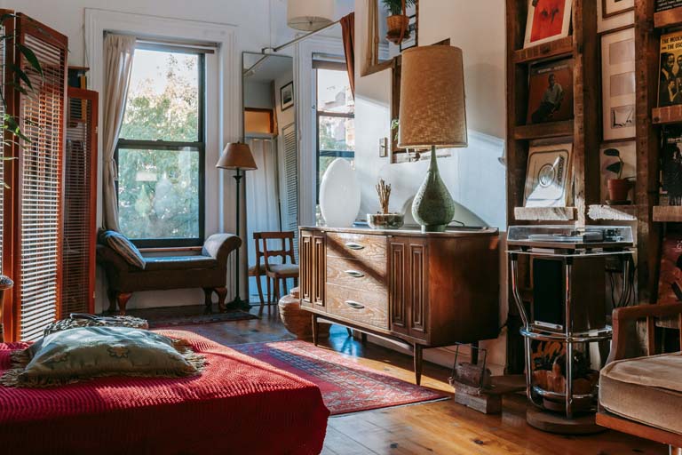
- Take stock of your favorite furniture pieces – Do they all have a similar style? If so, will a contrasting approach to the floor help them stand out? Or, is the style of your furniture eclectic, and a more uniform floor pattern would complement the overall feel?
- Review the colors of your walls and ceilings – Do you have a common theme to go by? Do you want an accent wall with a pop of color and a floor color that connects one room to another?
- Whichever way you want to go, make sure you see samples of the actual floor in the room or rooms involved. This is an important step. An easy way to do this is by opting for a shop-at-home service. A qualified flooring expert will come to your home and help guide you with your interior design choices.
- Light hardwood floors vs. Dark wood floors – This is a tough one because it often defies your preconceptions. Sometimes you can see a beautifully designed room with a light wood floor and think, "Wow, that's perfect." And sometimes, the exact same room with a dark wood floor will provide just the touch of boldness it deserves. The safest way to proceed is to insist on seeing enough samples of flooring colors, both in the actual room at home before you decide.

A Short Primer on RGB vs. CMYK and How They're Different
This subject can be technical and confusing, so you might want to steel yourself. Back in primary school, many of us learned how to create the color green by mixing blue and yellow pigments. A lucky few of us were taught to create a wide spectrum of colors by mixing yellow, black, red, and blue pigments. In the printing industry, blue is known as Cyan, and red is known as Magenta.
The acronym CMYK stands for Cyan, Magenta, Yellow, and the K stands for blacK.
As if this isn't complicated enough, CMYK pigments that are present in the paint on your walls, the fabrics in your furniture, and the materials on your floors are completely different than the way colors work when we're talking about light. As an example, In the world of light, what we know of as white light is created by combining Red light, Green light, and Blue light. These colors are known as RGB.

Why the Amount of Natural Light and the "Light Color Temperature" in Your Home Is Important
If your home doesn't have a lot of natural sunlight or plenty of light fixtures, it would be wise to stay on the lighter side of color choices than the dark side. (Unless, of course, dark and brooding is what you're after.)
During the day, sunlight coming into your home generally has a "higher color temperature." Color temperature is measured in Kelvin. Daylight has a color temperature of approximately 5000K or Kelvin. This means the light appears to be bright white as it falls on the objects inside your home.
At dusk, the temperate of the sunlight is approximately 2500K or Kelvin, and this means the light will appear to be more yellow or even light orange as it casts a warm glow on the objects in your home.
The more windows you have, the more the different color temperatures of sunlight at different times during the day will affect the appearance of the items in your home.
When it comes to the light fixtures in your home, color temperature works the same way. Some light fixtures/bulbs emit light at the higher end of the Kelvin scale and appear as bright white with a tinge of blue. Other light fixtures/bulbs, at a lower Kelvin value, appear more yellow in a way similar to the glow of candlelight.
Bright white or higher Kelvin light is often described as cold or harsh. Yellow light is a lower Kelvin, and it is often described as warmer and softer.

Why "Shop-at-Home" Is More Popular Than Ever
Shopping for a new floor is one of the most important opportunities you will have to create the look and feel you want in your home. You owe it to yourself to investigate beyond the flooring colors you would normally default to.
As you can gather from this article, there's a lot involved with picking the right color. Shop-at-Home service will bring a flooring expert to you. You'll be able to discuss design options and, most importantly, see the actual color of the floor in the specific room.
This is why more and more people opt for Shop-at-Home. It really can be the easiest and the best way to go. Give us a call today to get started!
(214) 390-0850

Dan Ratcliff
President and CEO of Flooring Direct in Dallas / Fort Worth.
Over the last two decades, he has grown Flooring Direct into a premier Shop-at-Home traditional & hardwood flooring company. With a true dedication to customer service and integrity, Flooring Direct has become DFW's largest highest-rated Dallas-local flooring dealer. Dan has lived in Dallas all of his life and was raised in Dallas with family roots and love for the community and local sports. It's with that sense of family that Flooring Direct has contributed to and sponsored children's organizations like Jonathan's Place and scholastic athletics like Plano's Girls Soccer.
- This author does not have any more posts.